How can I create a chart?

I have some data imported into a pipe, how can I create a visual?
Comments
-
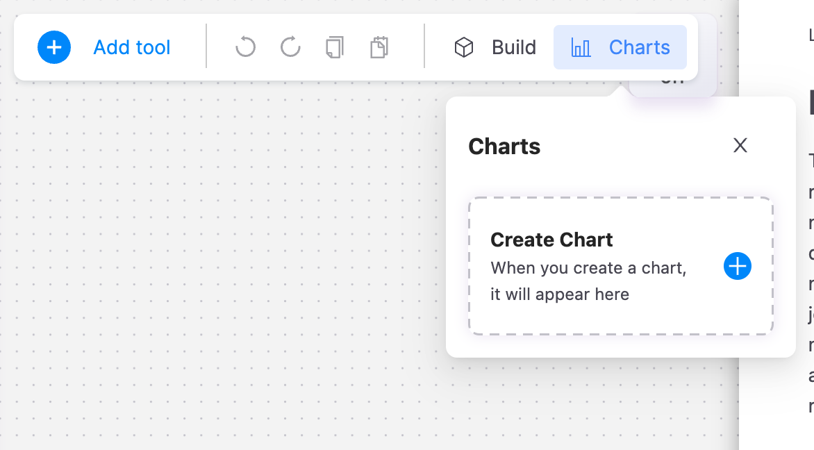
There's an option to create a chart at the top bar:
Also, please be sure to check out different ways of creating visualizations in the docs: https://app.symon.ai/assets/docs/en/visualizations.html